
When a new architectural landmark is in the works, it comes with a promise of something extraordinary that is a testament to human ingenuity and vision. With this comes specific characteristics that establish its presence. Against the backdrop of Chicago’s impressive skyline, a dark structure with towers of staggering heights commanding attention is identified as the Willis (Sears) Tower. On a more intimate scale, a reflective bean-like form that captures its viewers’ image and surrounding context places one at the cloud gate in Millennium Park, Chicago. On a global scale, the presence of glass pyramids gracefully punctuating the grounds of a courtyard surrounded by the grandeur of French Renaissance buildings puts one at the Louvre in Paris with an invitation to explore centuries of arts and culture.
Each of these landmarks, significant for varying reasons and a manifestation of their time and style, provide insights into where architecture, culture, and innovation intersect. Similarly, this essay embarks on a journey of architectural exploration focusing on the St Regis building by Studio Gang. In a position of merging design and purpose, the Saint Regis Tower prompts an investigation into the complexities of meddling architectural brilliance with social responsibility.
As Louis Sullivan inquired, “How shall we impart to this sterile pile, this crude, harsh, brutal agglomeration, this stark, staring exclamation of eternal strife, the graciousness of those higher forms of sensibility and culture...?” This inquiry echoes through time as designers face the challenge of infusing architectural innovation and cultural refinement.
This essay hopes to meticulously explore how contemporary architectural designs can transcend the limitations of aggressive modernism, embracing the ideals of social responsibility by examining the St Regis project and its intent to encourage porous connectivity and community engagement. By analyzing the project referencing the keywords site, material, structure, detail, and program, this study hopes to unravel the layers of architectural intention present in St Regis that make it successful in redefining architectural boundaries, offering insights into the intersection of aesthetics, community, and the environment in the 21st-century architectural discourse. The St Regis Tower was designed by the architecture firm Studio Gang, led by Jeanne Gang. It is an award-winning architecture, interior design, and planning firm based in Chicago with offices in New York, San Francisco, and Paris and projects around the globe. The practice has established itself as a trailblazer in architecture, successfully combining design, community engagement, and social responsibility in many projects. By examining other architectural marvels, including their previous projects and design philosophy, we can gain insight into the studio’s approach to creating meaningful spaces that go beyond aesthetics.
SITE
St Regis is located south of the Chicago River in the Lakeshore East neighborhood of the Near North Side community area of Chicago. Magellan Development Group’s Lakeshore East is a 28-acre residential development on a former freight yard near the Chicago River and Lake Michigan confluence. Its masterplan design was completed by Skidmore Owings & Merrill (SOM) in 2001. Lakeshore East is a section of the New Eastlake neighborhood bordered by Columbus Drive on the west and mainly contains buildings from the 21st century, unlike the rest of New Eastlake, with buildings dating as far back as the 1960s. The development houses a 6-acre park in its center, anchoring the neighborhood’s walkability and connection to nature. Around the park rise several high-rise buildings with primarily residential functions. Nearby, one can find various dining options, a village market, and convenient access to Chicago’s riverwalk and lakefront parks. These amenities make a compelling argument for constructing 393 condos at this site.
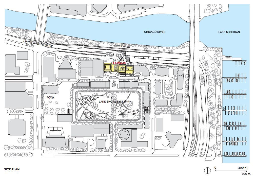
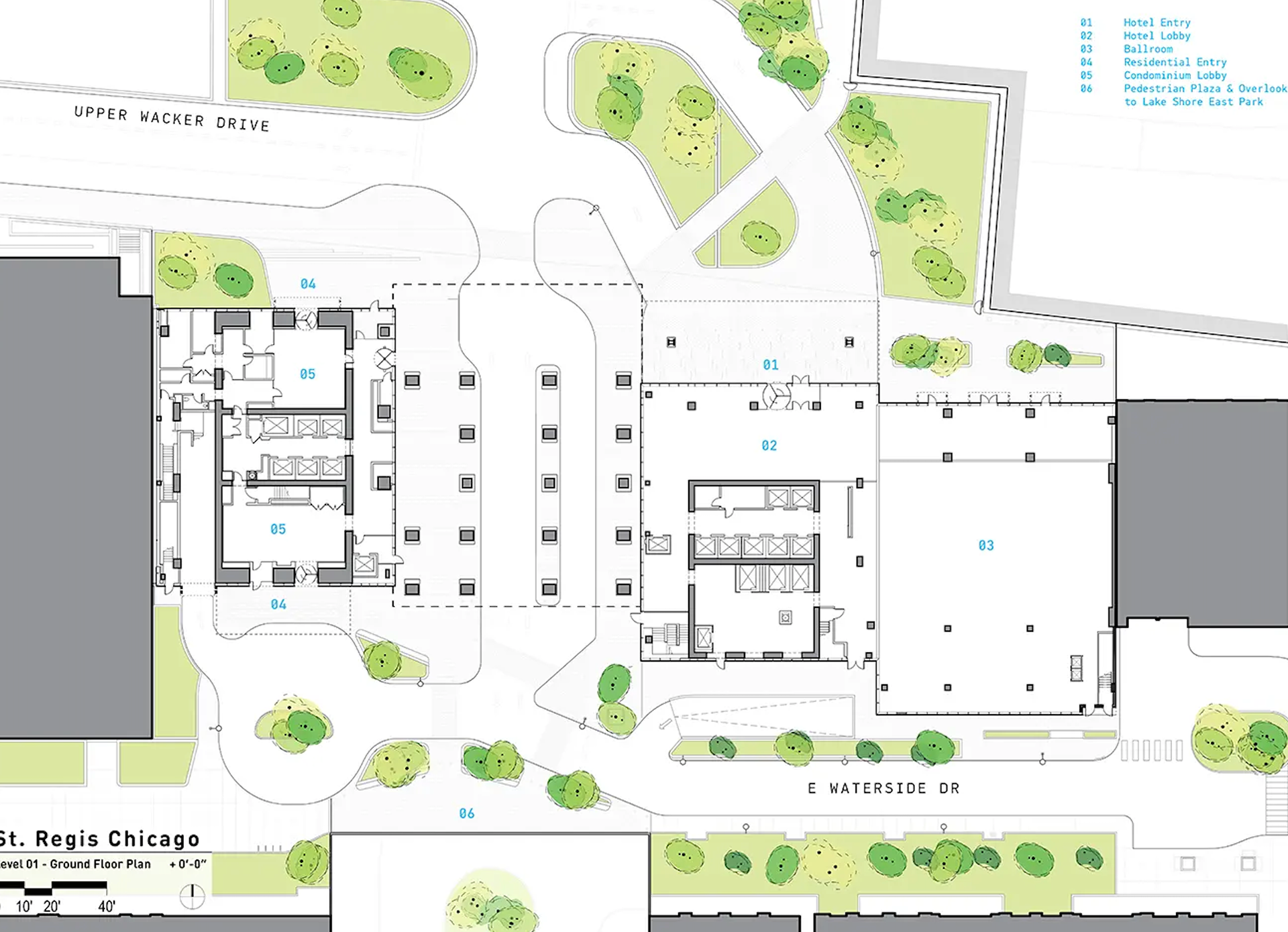
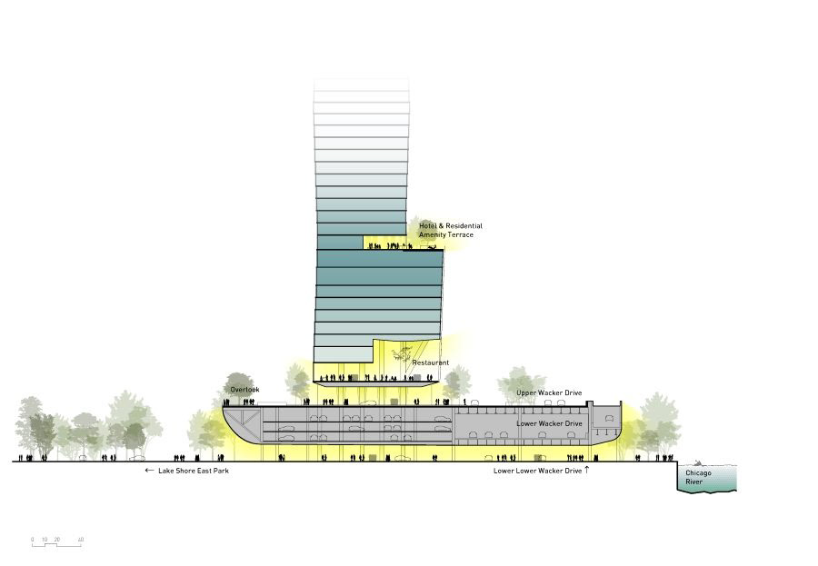
The building’s 52,000 sf site is situated amidst two other existing buildings, one to its east and the other to its west, with a stacked boulevard of E Wacker Drive and E Lower Wacker Drive on its northern side and the community’s 6-acre park on its south. Designing the St Regis Tower site can be perceived as having presented a difficult challenge, primarily due to its location. Most buildings surrounding the area were strategically situated at the edge of the setback and boundary lines to maximize real estate and enhance efficiency. Nonetheless, the designers of the St Regis Tower resolved to adopt a different approach to the project, notwithstanding the challenges posed by the location.
The Writer’s Theater in Glencoe, Illinois, is an excellent example of how a building’s design can be integrated with its surroundings. The theater’s location in the middle of a wooded area has allowed its architecture to be intertwined with the natural landscape. The building’s façade elements blend seamlessly with the environment, creating a harmonious dialogue between the structure and its surroundings. Additionally, the design choices of the building invite users to immerse themselves in the beauty of the surrounding nature.
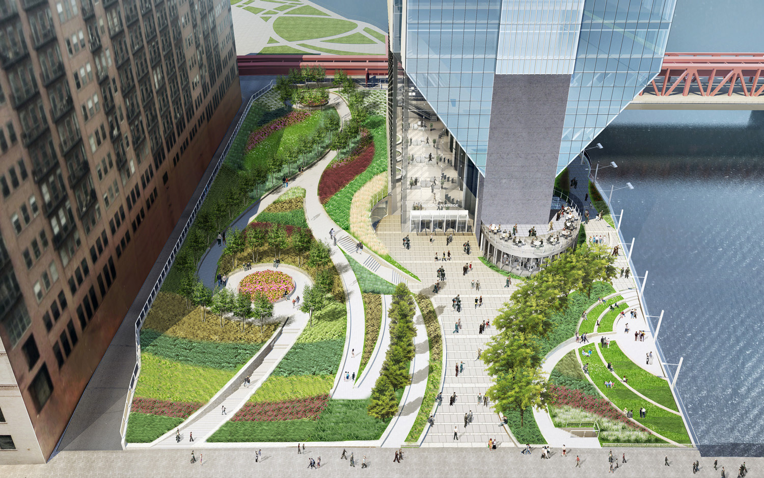
This approach cannot be taken at St Regis’ site, so it is interesting to see how the designers approached the site. A significant feature of the building is that one of its three slender towers was raised to create a new pedestrian connection between the Chicago Riverwalk and the outdoor recreational facilities of the community. The building could have easily covered the whole site, as this connection was not a requirement, but this one significant design choice was a catalyst for improving the urban experience at the site. A common theme here is how, in two completely different situations, the architect has paid attention to how a building can create better experiences for its users and the public and has responded to that successfully on different scales. With the writer’s theater, the designers had an opportunity to celebrate the landscape, whereas, with St Regis, the designers were able to transform an urban landscape to create a more accommodating communal landscape.
The Writer’s Theater in Glencoe, Illinois, is an excellent example of how a building’s design can be integrated with its surroundings. The theater’s location in the middle of a wooded area has allowed its architecture to be intertwined with the natural landscape. The building’s façade elements blend seamlessly with the environment, creating a harmonious dialogue between the structure and its surroundings. Additionally, the design choices of the building invite users to immerse themselves in the beauty of the surrounding nature.
This approach cannot be taken at St Regis’ site, so it is interesting to see how the designers approached the site. A significant feature of the building is that one of its three slender towers was raised to create a new pedestrian connection between the Chicago Riverwalk and the outdoor recreational facilities of the community. The building could have easily covered the whole site, as this connection was not a requirement, but this one significant design choice was a catalyst for improving the urban experience at the site. A common theme here is how, in two completely different situations, the architect has paid attention to how a building can create better experiences for its users and the public and has responded to that successfully on different scales. With the writer’s theater, the designers had an opportunity to celebrate the landscape, whereas, with St Regis, the designers were able to transform an urban landscape to create a more accommodating communal landscape.
In addition to the new connection, the designers also integrated greenery into other building parts. Despite a 6-acre park in front of the building, terraces on the top floors were developed to include more greenery. Moreover, the building was situated further from the site boundaries, and greenery was added amidst the drive-through and drop-off area. The drive-through, which is not directly on the main street, helps to minimize traffic congestion when people are being dropped off for various functions in the building, further improving the human experience in the area
ST REGIS CHICAGO SITE PLAN

MATERIAL
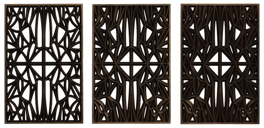
Regarding materiality, Studio Gang has succeeded in developing innovative and sustainable practices for their projects. The Arcus Center for Social Justice Leadership in Kalamazoo, Michigan, is an excellent example of a project with great materiality. This project features an aesthetic cordwood wall that conveys a narrative of purpose. The wood masonry wall made of 2-12 inches diameter Northern White Cedar logs that were locally sourced is a high-performance wall that sequesters more carbon than was released while building it. It further served as an avenue for community engagement as it was easy. Contributing to the wall’s construction gave the community members a sense of pride because they could look at this beautiful façade and feel connected to it. It makes it feel more like it belongs to them as they were able to contribute to it.
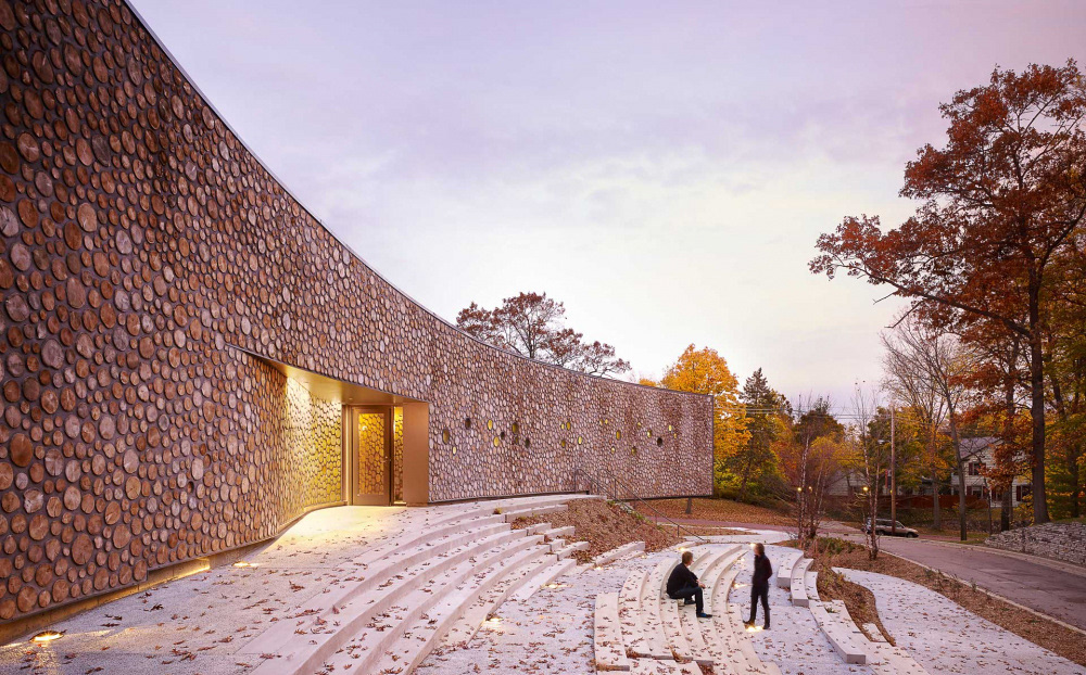
cORDWOOD WALL OF THE ARCUS CENTER

WOOD VS BRICK
As with the varying site conditions of St Regis compared to the writer’s theater, the scale and function of the former and the arcus center vary widely, so it is interesting to see how materiality was approached in this situation.
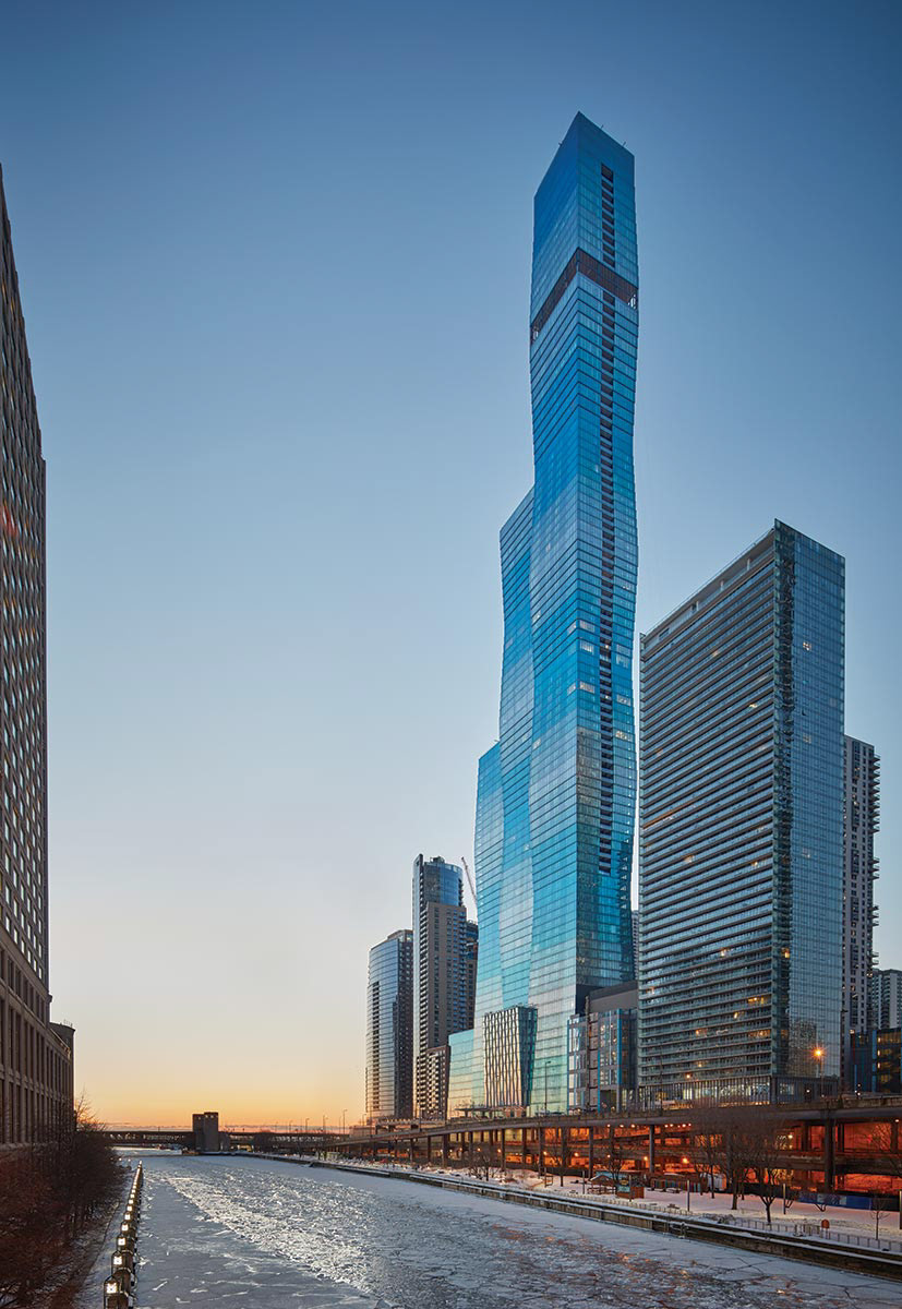
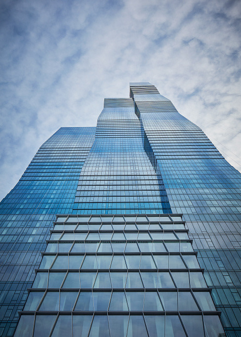
A glance at the St Regis building would show one a stunning array of a variety of shades of blue glass adorning its exterior. Upon closer examination, one notices that the glass is the darkest at the narrowest part of the building, which is the topmost part of the repeating frustum. As the elevation of the tower widens, the shade of blue on the glass lightens to give a gradient effect that is truly a sight to behold. One could think that this was done to strengthen and accentuate the effect of the variation of the floor plate sizes in the same way shadows and highlights work, as a darker shade might appear smaller and a lighter shade more open and bigger. While this might have been one reason for this design, the six different tints of the facade’s glass have a more profound purpose. The darker shades of blue on the smaller floor plates allow enough natural light to come in, but as the floor plates get deeper, the glass tints get lighter, allowing more natural light to penetrate all the way through the floors.
The glass cladding also allows for transparency and uninterrupted city views around the building. The lightness of the glass is also helpful because there is less weight for the foundation to carry, unlike if the building was clad in stone. The glass also helps to emphasize the sleek nature of the building further.
Although the building did not employ any new or rare material types, its designers successfully used ordinary materials creatively to create extraordinary buildings.
STRUCTURE
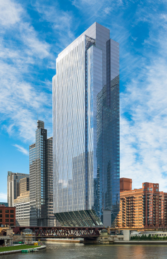
Drawing from the previous discussion on site, one can note that the center tower of the three towers that comprise the St Regis building was lifted above the ground. This tower has 75 occupied floors above it, so one can wonder how it is supported.
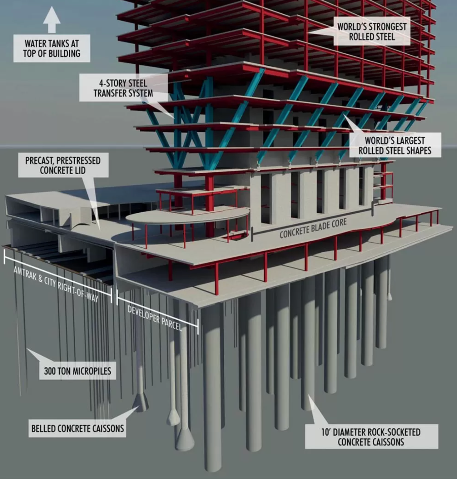
Designed by the same structural engineering firm - Magnusson Klemencic Associates, and sharing some structural elements as the St Regis tower, the gravity-defying 150 N. Riverside leaves many guessing how it works. On a site that remained vacant for a very long time because of its challenges, the architects at Goettsch Partners saw an interesting problem and came up with an exciting solution. It sits on the site of a former railyard on the southeast side of the confluence of the three branches of the Chicago River. The tracks of the railyard still exist and are used by the Amtrak trains. They are under the ground plane of this site, on the west side, and could not be moved. They also had to remain fully functional during the construction of 150 N. Riverside. On the east side of the site is the Chicago River, and with that comes the regulations of the 30ft setback by the city of Chicago to allow for the continuation of a publicly accessible riverwalk.
150 N Riverside building
150 n riverside site
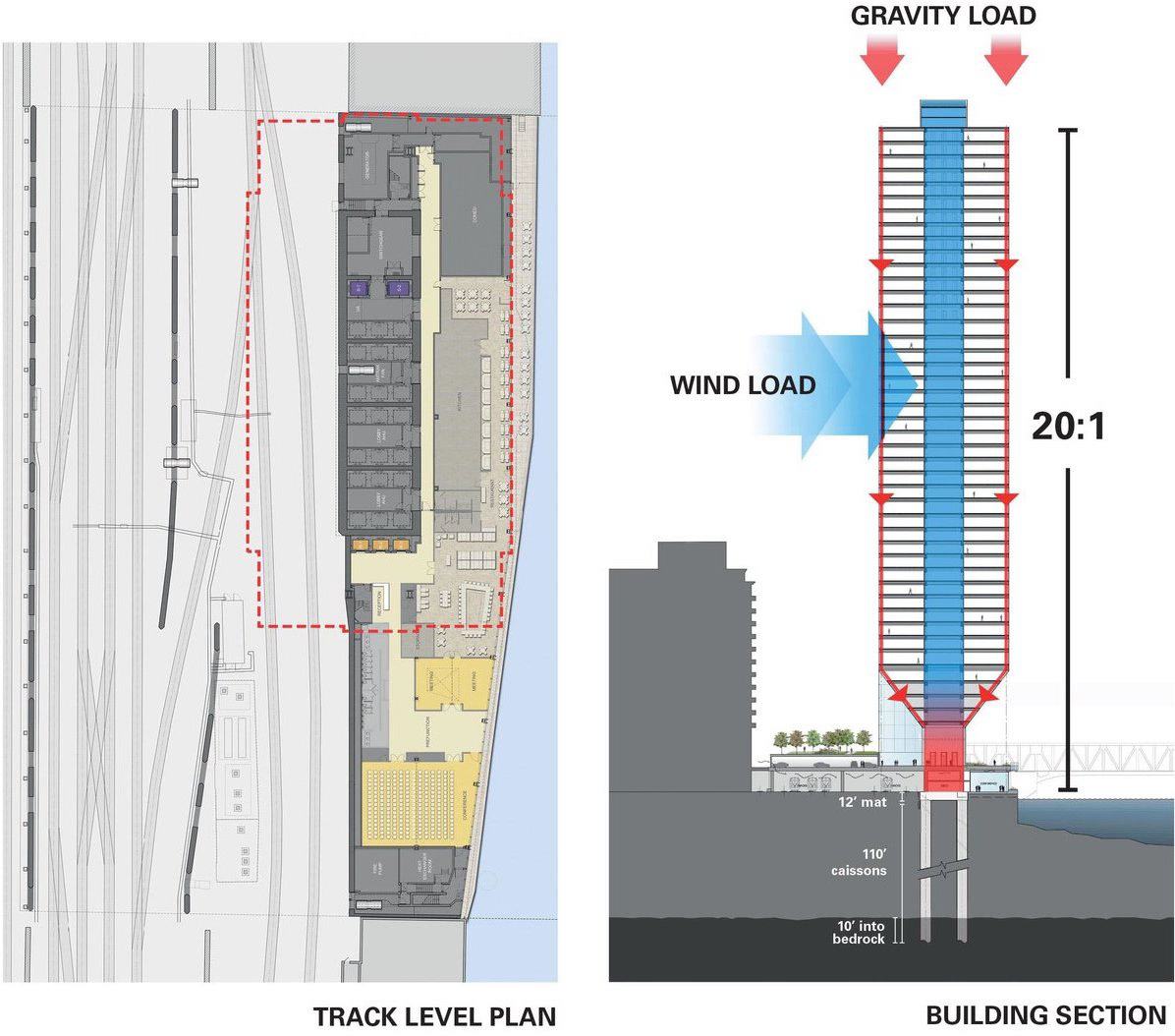
These restrictions only left a 39-foot wide space where a building could sit, encompassing only 25% of the 2-acre site. On the remaining buildable portion of the site, the core rises as the only continuous element throughout all 54 building stories. In the span of the first eight floors, the building slopes outwards until it reaches the full floor width of 120 ft that continues to the higher floors. A triangular truss from the eighth floor makes it possible for the weight of the vertical forces, carried by the perimeter columns, to be transferred to the core and then to the caissons, which were drilled over 110 feet below grade level. A tuned mass damper, a water tank at the top of the building, helps to resist wind loads. The water in the tank moves in the opposite direction of the building when there is a wind force, and this counteracting force helps create better stability. This clever structural feat allows this site to contain a Riverwalk, a park, outdoor seating areas, and an amphitheater.
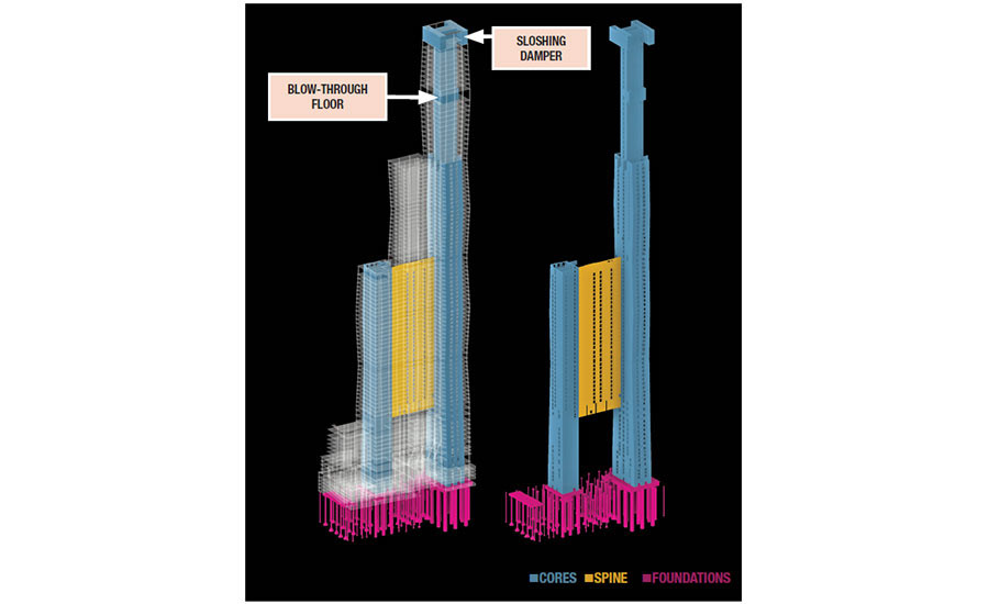
Just like 150 N. Riverside, the site of St Regis was squeezed in on all sides, but this time, by roads, buildings, and a park, as discussed earlier, which posed a challenge to the tower’s construction. In the case of the former, they could put barges on the river for cranes, but this opportunity was not present for St Regis. Hence, the engineers had to be clever in constructing the building while keeping the streets around it functional. Both buildings faced structural challenges that were met with structural innovation because of designs beneficial for social and community reasons on the ground plane. Where mandatory restrictions heavily influenced the design of 150 N Riverside, the case of St Regis was quite different. It is unclear if the decision to raise the middle tower was a solution to a requirement. The narrative pushed so far puts the design decision to raise the middle tower as one made by the architects to allow the skyscraper to be a ‘porous connector’ in a way the preceding site conditions did not allow.
In this case, where there would usually be three cores supporting the three towers to resist high winds, the hovering tower is not able to have its own core and is supported by the two other towers on either side, one of them being 51 stories and the other being 101 stories. To resist wind loads, the engineers designed a system that allows the cores on the outer towers to be tied together by a 2 ft thick, 508 ft tall, and 123 ft wide reinforced concrete spine that runs through the middle tower from the 15th to 51st floors above the street grade level. This was not enough to resist gravity load, so some columns go into the foundations that support the spine but still do so in a way that does not disrupt the connection below the middle tower. This act of tying together the outer cores with the spine to resist wind loads makes the cores act as one element, where the wind loads on the center tower are transferred to the more stable cores on either side.

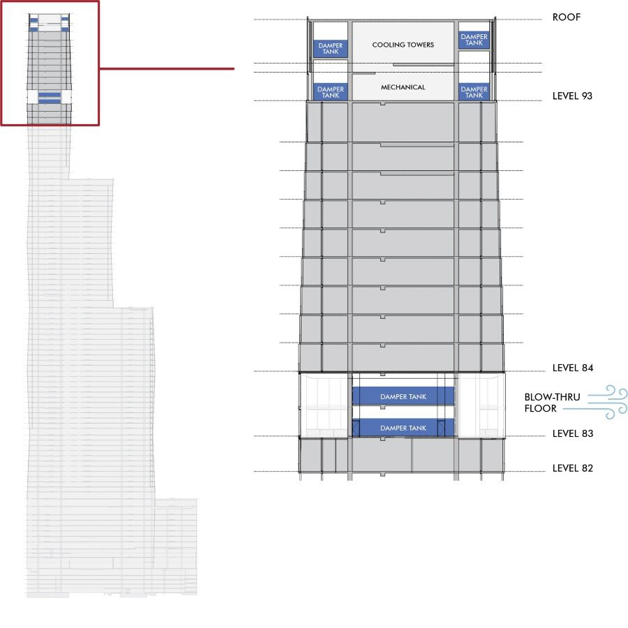
Sloshing dampers, like in the case of 150 N Riverside, were employed near the top of the building to accommodate wind forces further. Six of these dampers carried about 400,000 gallons of water, with four of them on the 97th and 99th floors. The remaining two were placed on the 83rd floor, which is different from any other floor in the building and is the first of its kind in the city of Chicago. When construction of the building was underway, a wind test revealed that because of how slender and tall the tower was, the devices mentioned above were still insufficient to resist the swaying caused by lateral loads to a suitable level for human comfort. These led the designers to choose to turn the 83rd floor into a 2-story blow-through floor where the final two sloshing dampers are located. The blow-through floor has no curtain walls, allowing the wind to pass through the building instead of going around it.
Apart from the cast-in-place core and spine, there are also perimeter columns at the edges of the building. Because of the undulating nature of the floor plates, the columns needed an unconventional approach. The first initiative for the perimeter columns was to have them slanted, but these would have been too expensive, more complicated to build, and would have taken more time. Another option was to have vertical columns run through all the floors and have the wider slabs cantilevered. This would have resulted in columns being randomly placed in living rooms or bedrooms and obstructing the flow of open spaces in some units. The solution was stepping the perimeter columns 5 inches on every floor to support the tapered post-tensioned floor slabs, which visually looked like sloped columns when all the floors were viewed in conjunction.
They had to go very deep for the foundation as the higher-up soil, made up of a marshy infill from the Chicago fire, was not solid enough to hold the building. The building has 124 drilled piers. Twenty-four are 8 or 10 ft in diameter and extend 115 ft below grade. The other 100 are belled caissons and extend 85 ft below grade.
The building’s structural innovation is a testament to making changes prioritizing the human experience and comfort. Building elements could have changed to make the structure easier. However, the designers had a vision for the community and the residents of the building and created opportunities for its accomplishment.
DETAIL
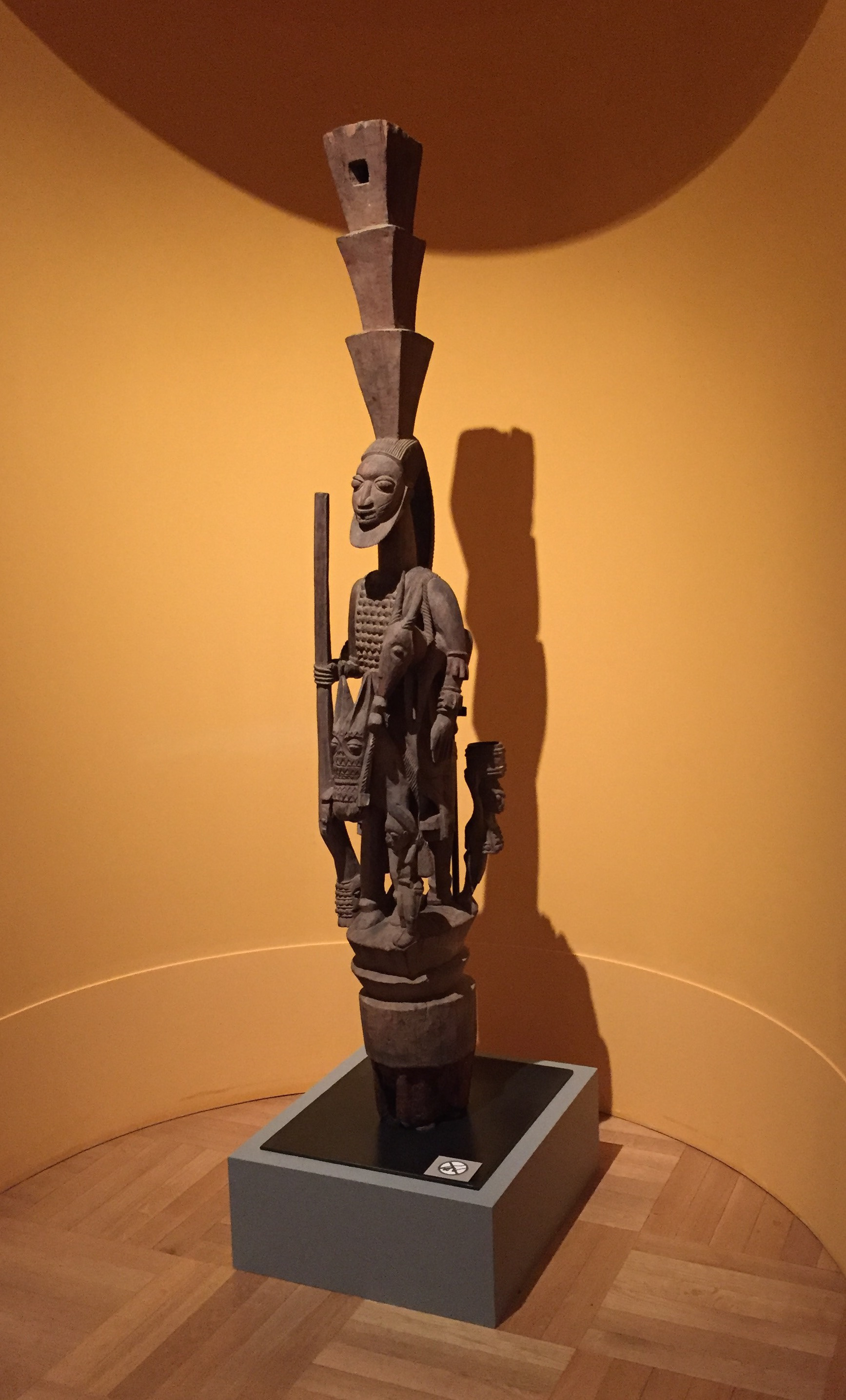
Shifting gears from the technical underpinnings of the St Regis building, we can focus on something more visible to most people observing the building – its detail. Usually, when the average person says a building has a lot of detail, they refer to the amount of ornamentation on it. A tour guide on a Chicago River boat tour once explained ornamentation like the icing on the cake, with different architects in different periods holding back on the icing and others having varying layers of icing and more decoration details than others. An example of extra icing would be a building with columns that serve no structural purpose and are purely for aesthetics. A specific example that leaves people in awe is the former Carson Prairie Scott building by Louis Sullivan at the intersection of State St. and Madison St. in Chicago. Its rounded corner entryway especially is referred to as having the most detail. Even the capital of the columns in the target now occupying the space has intricate details. Coincidentally, this building was built not too long after Sullivan’s essay – The Tall Office Building Artistically Considered, from which a quote was drawn at the beginning of this essay.
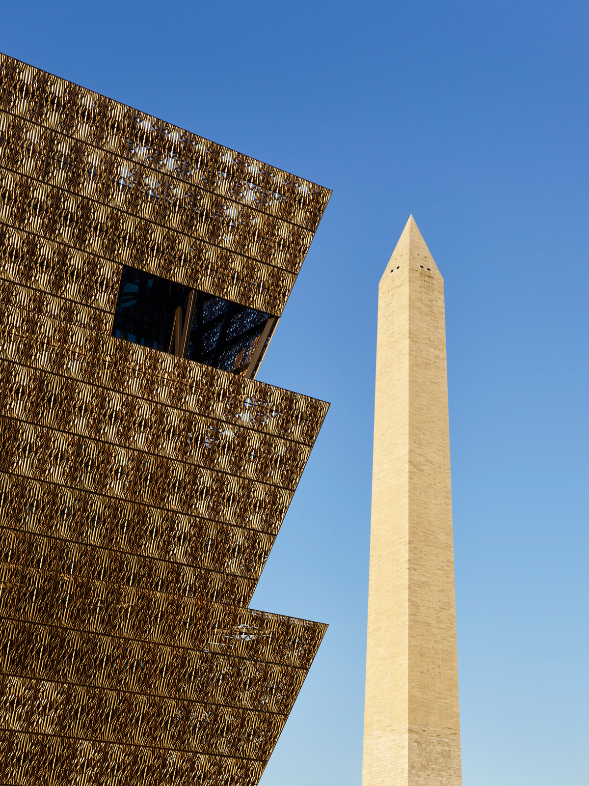
A more recent building with striking detail is the Smithsonian National Museum of African American History and Culture in Washington DC, designed by the internationally acclaimed architect David Adjaye. The most obvious and talked about detail is its filigree envelope. This ornamental lattice is made of cast aluminum and coated in a mixture of Valspar’s Black Fluropon and three custom-made colors – African Sunset, African Sunrise, and African Rose- applied by hand to create natural variations. When rays of sunshine hit these panels, they have an iridescent nature that makes the panels display hues ranging from shades of brown to bronze and gold, strengthening the dynamic nature of the façade. Three thousand six hundred panels make up the lattice. These panels’ sizes reference the Monument stones. They come in 4 different densities and opacities that vary between 65% and 90% and are strategically placed to control the amount of sunlight that gets into the interior as well as the transparency of spaces in the building so that public spaces get much natural light, and exhibition spaces with art are protected from direct sunlight and glare.

The other significant building details include the ‘porch’ at the main entry that creates an outdoor space that bridges the gap between the indoor and the outdoor and the corona shape of the building, whose angles match the 17o angles of the Washington Monument Capstones, which, together with the filigree envelope, carry more meaningful details beyond the visual features that tell historical narratives.
The porch detail references porches, which during slavery was the demarcating element between the family and the enslaved people. However, it has become a welcoming element with architectural roots in Africa and its diaspora, especially the Caribbean and the Southern parts of America. The corona shape of the building alludes to the three-tier crowns found on Yoruba caryatid sculptures by an artist called Olowe of Ise from the Yoruba tribe of West Africa, primarily found in Nigeria. Finally, the lattice that clads the building is a historical reference to African-American craftsmanship, paying homage to railings crafted by 19th-century enslaved African-Аmericans in New Orleans, Louisiana, Charleston, South Carolina, and elsewhere. African-American ironworkers crafted this contemporary flare on the historical ironwork.
The porch detail references porches, which during slavery was the demarcating element between the family and the enslaved people. However, it has become a welcoming element with architectural roots in Africa and its diaspora, especially the Caribbean and the Southern parts of America. The corona shape of the building alludes to the three-tier crowns found on Yoruba caryatid sculptures by an artist called Olowe of Ise from the Yoruba tribe of West Africa, primarily found in Nigeria. Finally, the lattice that clads the building is a historical reference to African-American craftsmanship, paying homage to railings crafted by 19th-century enslaved African-Аmericans in New Orleans, Louisiana, Charleston, South Carolina, and elsewhere. African-American ironworkers crafted this contemporary flare on the historical ironwork.
The attention to detail at NMAAHC’s building creates architecture that transcends time and culture. Although St Regis’ typology varies significantly from the museum’s, we can already draw a similarity with one of the design elements in both buildings’ facade designs. This element is the different hues used to create more interest in the façade, as discussed earlier in the section on materials. As the sun enhances the façade in the museum, the sun also creates a beautiful glowing effect on the facade of St Regis.
Referencing the idea of cake and icing again, every building has at least a crumb coat because they must be clad somehow. While the NMAAHC building has more ornaments on the façade than St Regis, with the glass as its crumb coat and the corona lattice as extra icing, St Regis has found a way to upgrade the usually uninteresting crumb coat. In this case, the cake itself is the ornamentation. The cake has been carved to create an attractive shape, and the crumb coat has been upgraded with a gradient of colors. The necessary elements of this cake have created ornamentation without any additional icing, which differentiates this building from any other rectangular skyscraper clad in one shade of glass throughout the building.
The building’s shape was heavily influenced by a naturally occurring shape in crystal formations – the frustum, essentially a truncated pyramid. This shape is continued along the height of the building with alternating stacks of 12-13 floors that vary from 80 ft square floor plates to 90 ft square floor plates. Committed to the frustum, the designers have also used this shape in different scales in other building areas, including lighting patterns above the passageway underneath the raised center tower and the projected canopy entry of the hotel. The shape is also found on the pavers on its exterior and the mullions of the glass cladding in some areas on the lower floors.
Although St Regis does not go about ornamentation as one usually expects, its designers’ attention to detail does not go unnoticed as they have found ways to beautify the building with its necessary elements, which further contributes to the sleekness of the building.


PROGRAM
Beyond the visible facets of the building lies its program – the carefully orchestrated blueprint that organizes the building’s functional spaces and the activities and experiences that occupants and users alike will encounter. St Regis is established as a luxury condominium building, so it is no surprise that most of the building is occupied by residential units.
The 393 residential units occupy the levels from floor 13 and above, including one-bedroom residences between 1,017 sf and 1,361 sf, two-bedroom units that range in size from 1,386 s to 1,620 sf, three-bedroom units varying from 1,942 sf to 3,734 sf and four-bedroom units between 4,565 sf to 5,212 sf. From the 71st floor, there are full-floor penthouses with 360-degree views. All these units are only for sale and are not available for rent.
An amenity floor is on the 47th level for the residents’ convenience and pleasure. Some of the building’s amenities include an outdoor oasis with a pool and spa, a sky lounge, access to the Saint Regis Chicago hotel amenities, a golf lounge, a fitness room, a drawing room, a study, a cinema, a private dining room, a demonstration kitchen, a wine vault, a terrace/all season kitchens, a wine, storage room, a children’s club, on-demand Tesla vehicles, a dog lounge and retreat.
Most of the lower floors of the building are occupied by the St Regis Hotel Chicago, which the building is named after. The hotel has 192 rooms and even more amenities, including a fitness center, heated indoor pool, saunas, outdoor sun deck, yoga studio, private fitness rooms, dining experiences, spa, ballroom, and meeting rooms.
Amenity-rich buildings seem to be a trend in Magellan’s buildings in the Lakeshore East neighborhood and beyond. Comparing St Regis to the other properties in the neighborhood by Magellan Development Group, one detail stands out – it is one of the buildings that does not have a retail component, the other two being Magellan’s first condominium building completed at Lakeshore East and a newer luxury development called Cascade. This is interesting because it seemed like after the company’s first building in the neighborhood, they found retail in the residential buildings to be an essential component, and for some reason, they have excluded it from their two newest buildings. In the case of the Cascade building, there is a 36,000-sf public park called Cascade parked anchored by the building and another one nearby. However, the building is not very porous in the case of St Regis. Now, this connector beneath it can be perceived as an element that lets people pass through it because only a limited class can afford to live in the building by buying one of its condos or staying a few nights in one of its hotel rooms. This is probably because it is a luxury building; in that case, its program caters to its inhabitants and not the rest of the public - a contrasting feature to some other publicly accessible landmarks in Chicago, like the Sears Tower, the John Hancock Tower, and the Trump Building, with varying levels of public access.
So far, the program is the first element of the building that leaves me with questions about the building accomplishing its goals in community engagement. As stated earlier, the designers performed their social responsibility to the residents. However, the programmatic elements project differently for community members, especially in a building that is supposed to benefit the community.
To conclude our discussion on this new landmark, characterized by three wavy human figure-like towers that glow in shades of aqua, a beautiful addition to Chicago’s skyline that stands as it has always belonged there, we reference an article on the Social Responsibilities of an Architect, Shruti Ramteerthkar, an architect, where she says:
“Nowadays, architects are being part of a bigger game wherein having a holistic approach towards user-centric design, climate responsive design, and design which adheres to the current social fabric with a view to attempting corrections in what has gone wrong becomes crucial.”
After analyzing the site, materials, structure, detail, and program of the Saint Regis project, we can determine if this skyscraper sets a good precedent for future projects and if the designers performed their social responsibility roles excellently. In a world where architects barely ever get to decide the sight of their buildings, the St Regis Tower was in an ideal planned neighborhood development. It further employed its site as a new essential pedestrian connection between the Chicago Riverwalk and the nearby community park. Its materials were carefully chosen, and the glass enhanced its beauty, detail, human comfort, and solar performance. The structure was crucial in making the pedestrian connection on the side of success and optimizing the comforts of the building’s inhabitants. Attention was paid to the building’s details, further enhancing design goals in the building without being overwhelming. The only factor that did not align fully with those mentioned above was the program, which worked perfectly for the building’s inhabitants but not for the public. I would say the architects were socially responsible while designing this building. However, a new question arises – Can luxury apartments be accessible to the general public, especially when it is an architectural marvel that would want to be explored?


